21 Hidden Details in Famous Logos
While the world seems like it has lost its creativity, in some ways, it certainly hasn't. As we will see in these company logos, some total genius behind the designer's desk snuck in an easy-to-miss detail that most won't see at first glance.
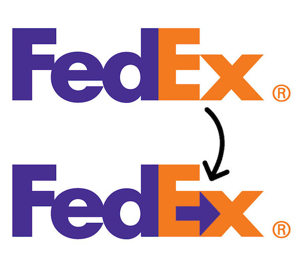
FedEx
There's a hidden arrow in the logo, symbolizing your package quickly moving forward to you (though, if we're being honest, it won't get to you in one piece).
Apple
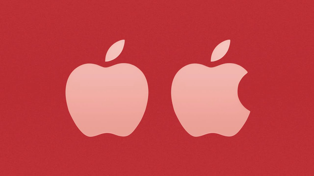
The logo has a bite taken out to symbolize a computer byte. And though it wasn't done on purpose, several Apple fans have come up with many theories behind the logo. One says that it's an apple because, in the story of Adam and Eve, the apple represents knowledge. But that doesn't hold up to scrutiny, because Apple got its name when the founders wanted it to be the first big name in the phone book, so they chose something that would come before Atari. And, in my opinion, the apple kind of looks better with the bite taken out.
Amazon

Nowadays, Amazon is almost the epitome of online shopping. eBay may come close on a really good day, but Amazon remains the giant for the time being. But have you noticed where the arrow at the bottom is pointing? The arrow goes from the A to the Z, representing how Amazon sells everything from A to Z. The arrow is also curved to represent a smile of the customer.
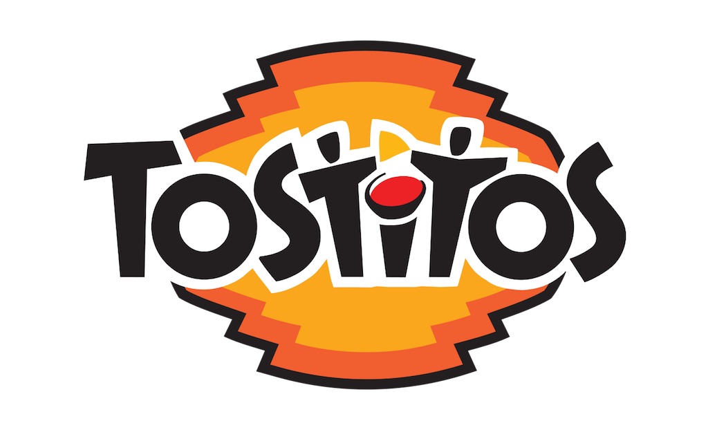
Tostitos
Tostitos is known for its chips and accompanying sauces, so this logo appropriately takes the two lowercase "t" letters and makes them look like two people and a bowl of salsa where the "i" is.
Goodwill
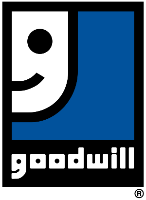
It looks like a "G" but also looks like a smiling face, given that Goodwill Industries International works hard to improve people's lives, hence putting a smile on their faces. It could also represent your smile when you declutter your home and donate your things to someone who may want them.
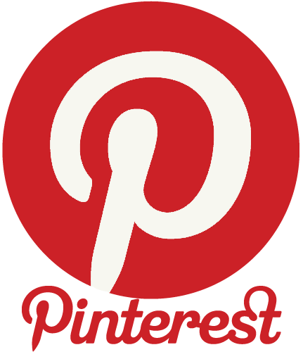
The logo is meant to look like the letter "P" for "Pinterest," but at the same time, it also looks like a push pin, which pays homage to Pinterest boards.
Tour de France
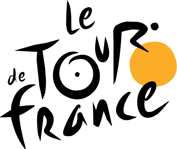
Contrary to popular belief, the yellow circle doesn't represent the sun. It's actually a bicycle wheel. And the "O" in "Tour" is the other wheel, while the "U" in "Tour" is the bicycle seat, with the cyclist being the "R."
Cisco
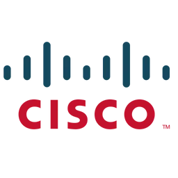
The company is headquartered in San Francisco, its namesake. And the logo itself is meant to look like the Golden Gate Bridge. This one is one of those things that you can't unsee once you see it.
Pittsburgh Zoo & PPG Aquarium
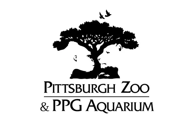
Speaking of zoos, this logo looks like a tree but also features a gorilla and lion looking at each other. Talk about a good use of negative space.
Kölner Zoo
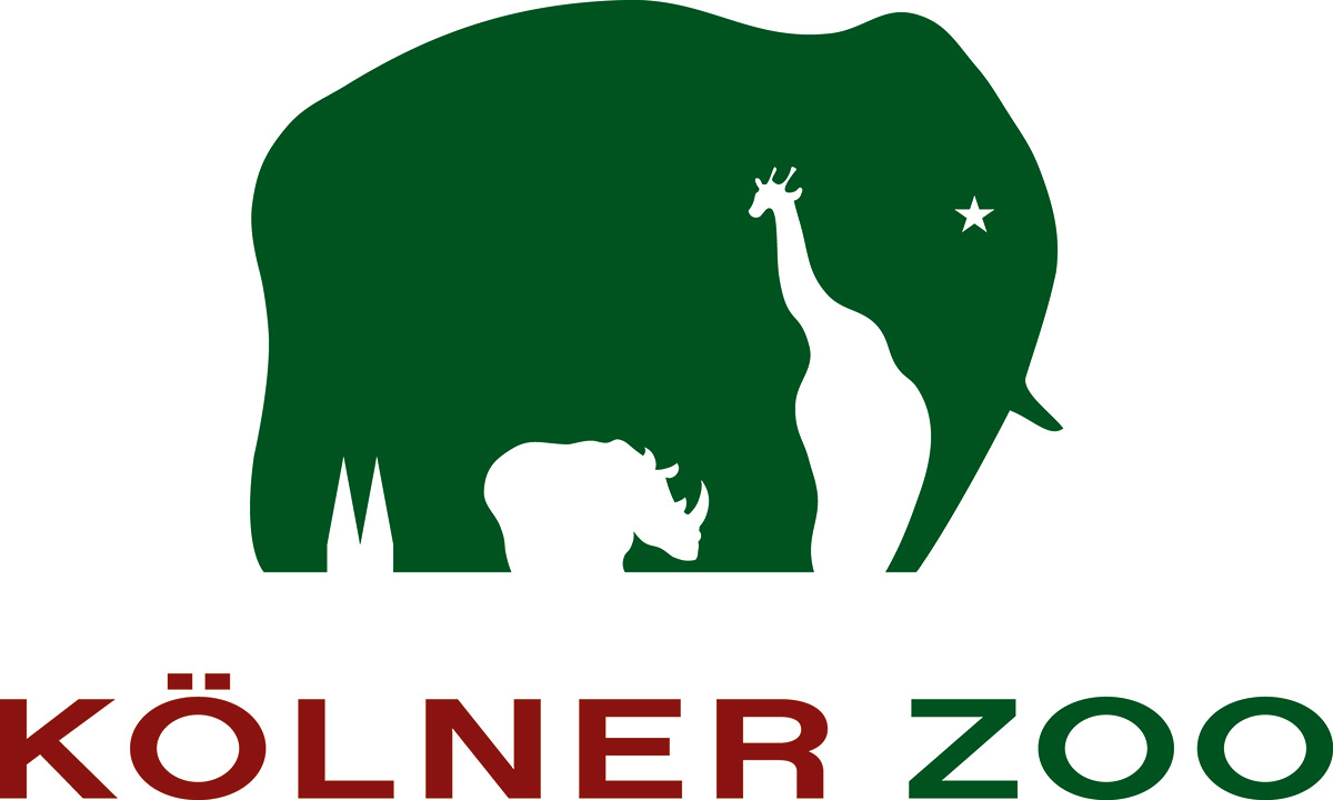
Speaking of negative spaces, this logo features an elephant with a giraffe and rhinoceros' silhouettes in between the elephant’s legs. And the two cones represent the Cologne Cathedral.
Beats by Dre
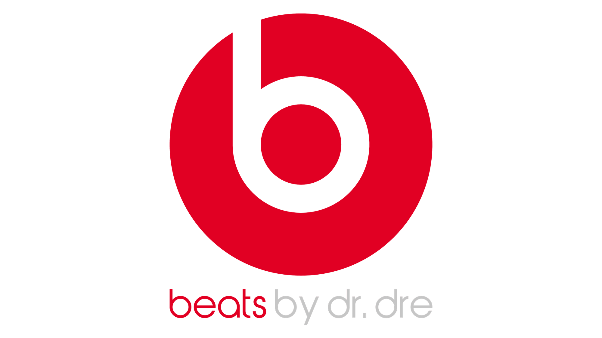
Obviously, it looks like a “b” but also looks like a head wearing headphones. This one was, for me, harder to decipher. I didn't see the head at all at first, and it was very debated as to whether or not this logo should be included on the list, given that it's a far stretch.
Baskin Robbins / 31 Flavors
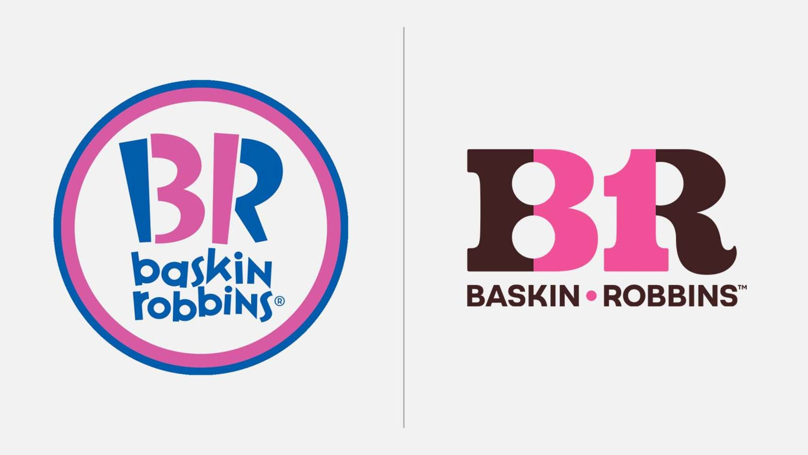
We're not going to debate about the logo change. But we will point out the cleverness behind the design. There's a “31” hidden in the “B” and “R” meaning 31 flavors. And for those who don't know, there is one flavor for every day of the month, hence 31 flavors. Though it is worth noting that, nowadays, the company offers more than 1,400 flavors (over 45 times as many as originally offered). But the name 31 flavors stuck around for nostalgic purposes.
Toblerone
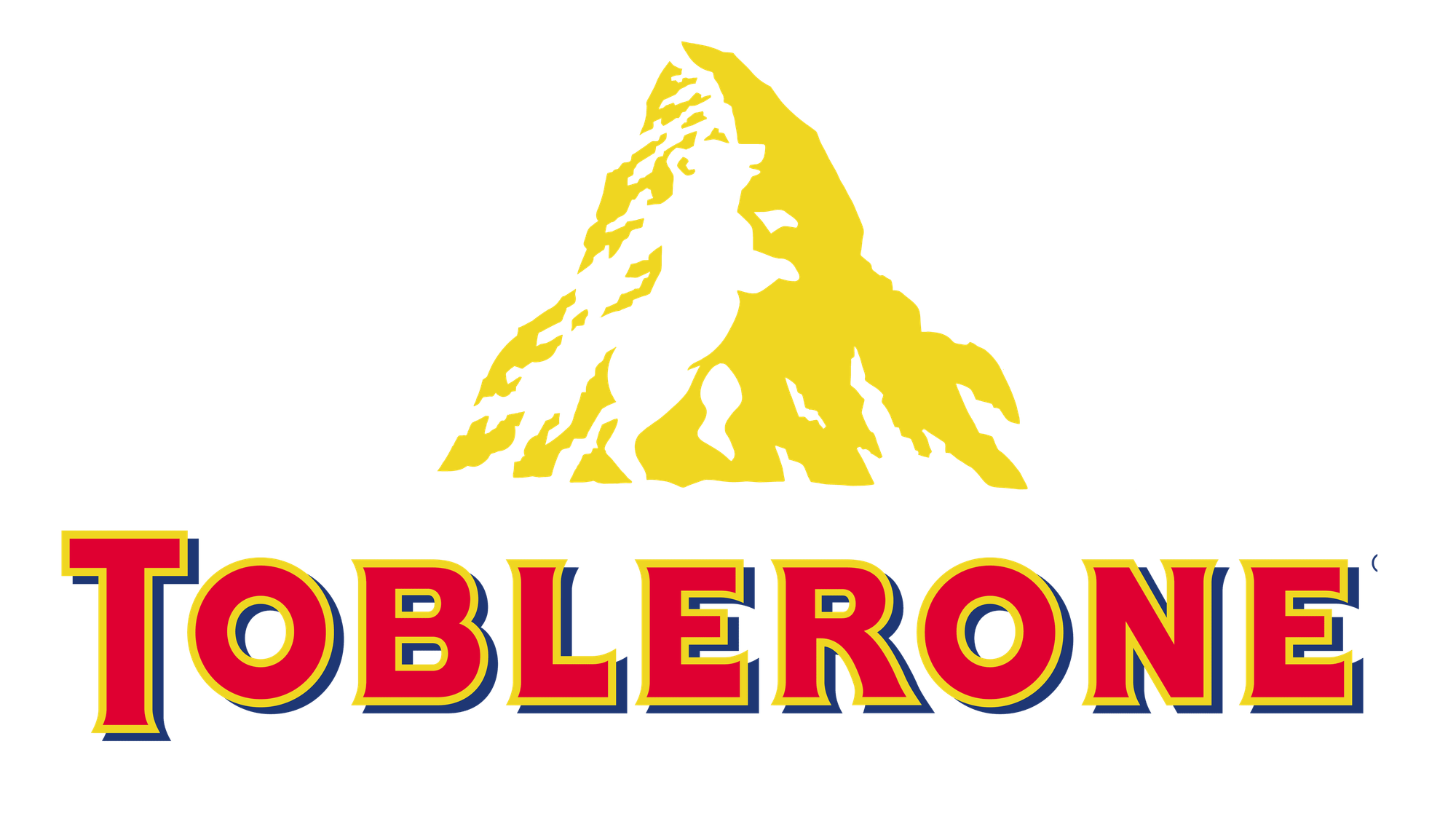
This is one of those ones where you can't un-see it once you see it. There's a bear shape in the Matterhorn. The shape is there because the bear is the official symbol of the city of Bern, Switzerland, where the original Toblerone was located. And like the FedEx logo, the Toblerone logo makes use of something known as negative space.
Milwaukee Brewers
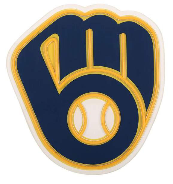
The logo is a baseball glove that has a lowercase "M" in the fingers and a "B" as the thumb and palm. Not only that, but according to the team themselves, the ball in the middle symbolizes the fans and the home city of Milwaukee being central to the team's organization.
Washington Capitals
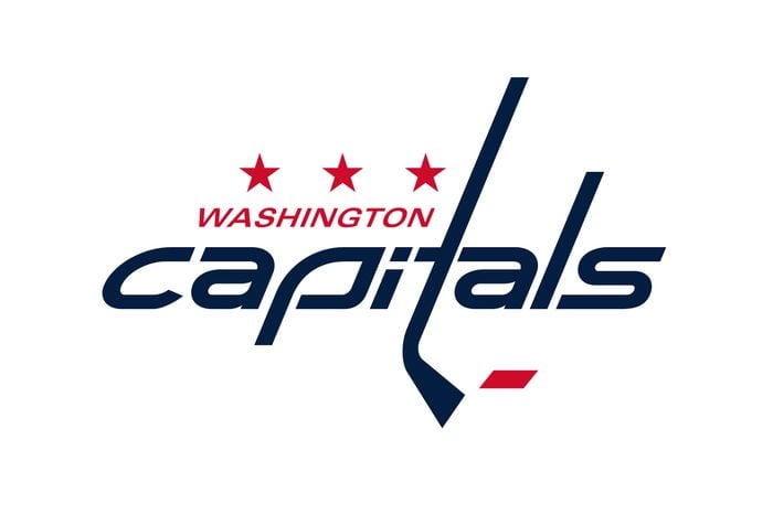
Originally, we could see an American eagle and the outline of the Capitol Building, but for the 2024-2025 season, the logo was changed in honor of the team's 50th anniversary. Not only does the logo feature 1970s aesthetics, the "T" looks like a hockey stick, and the three stars represent Maryland, Virginia, and of course, Washington DC.
NBC
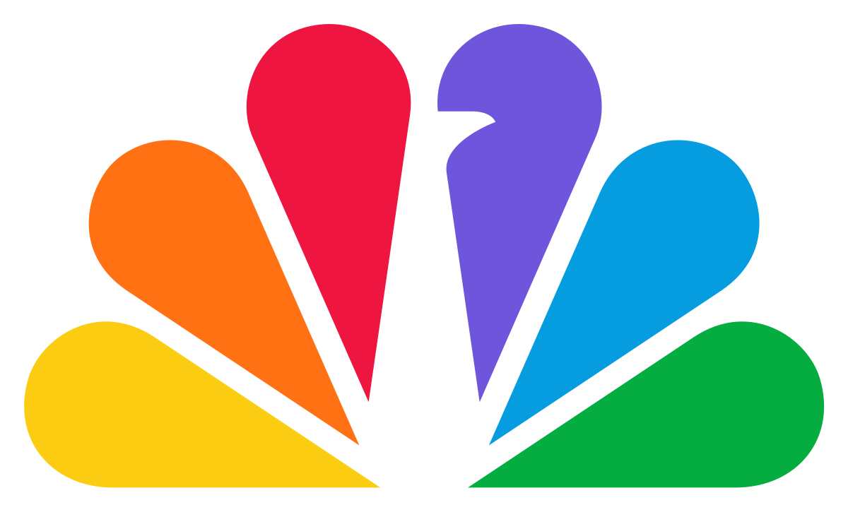
Believe it or not, this logo is meant to be a multicolored peacock. There's a divot taken out of the purple plume, which looks like a peacock's head, which is appropriate, given that NBC's nickname is the Peacock Network.
Tesla Motors
Many have assumed the logo to just be a cool, futuristic looking "T," but there's more to it than that. The “T” is actually a section of an electric motor. Perfectly fitting for a Tesla's power source.
LG
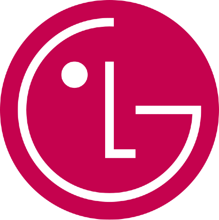
This one looks like a face, but the nose is an "L," and three-quarters of the head is a "G." But its name and logo date back farther than you might imagine. Back in 1947, the company began as Lucky Chemical Co, Ltd. It sold Lucky Cream, a type of makeup. Later, in 1958, electronics company Goldstar was founded in South Korea. After that, the Lucky Chemical Co. became the Lucky Group and purchased Goldstar, changing its name to Lucky Goldstar in 1983. 7 years later, in 1990, its initials, LG, became its name. And in 1995, the logo debuted. The face has since been dubbed "the face of the future."
Nintendo GameCube
Perhaps the most nostalgic logo on this list, every gamer from the 90s and 2000s will know this logo. Many have assumed the logo is a cube inside a bigger cube. Is that correct? Well, there's more to it than that. The bigger cube forms a "G" shape and the empty space between the lines is a "C" shape. On top of this, the smaller cube fits perfectly within the "C" shape.
Wikipedia
Their puzzling logo is an unfinished globe made of puzzle pieces with symbols from different languages on it. This represents the incomplete nature of the company’s ambition to be the go-to place for information in many languages.
London Symphony Orchestra
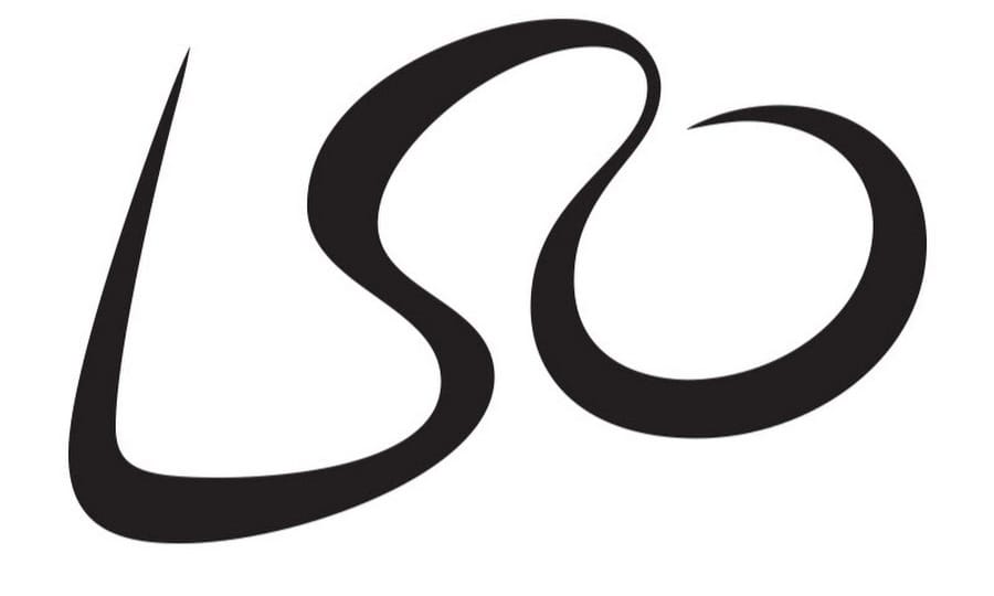
At first glance, you may think it's just the three initials in a fancy font, but there's a far cleverer design behind them. Their logo is a mashed-up L, S, and O, but also looks like an orchestral conductor. It's also said that, with logos like this one, there will always be someone who is unaware of the logo's design and may never be.
The Bronx Zoo
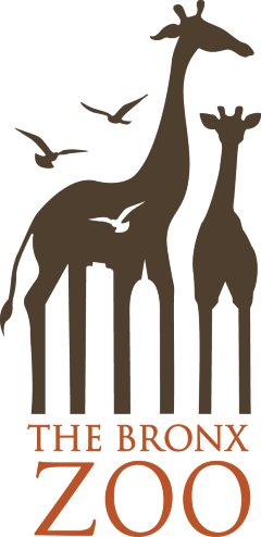
A zoo will obviously feature animals in its logo, but given the zoo's location, it would be nice to add some buildings, given the hyper-urban setting of the Bronx borough of New York City. So, you probably didn't notice the buildings in between the giraffe's legs the first time. But they certainly are there.
Which logo's hidden detail surprised you the most? Leave a comment!
Sources: Best Life, Reader's Digest
https://www.rd.com/list/secret-messages-company-logos/