Movie Character Concept Art We're Glad Didn't Make the Final Cut


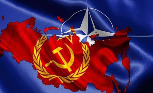
It’s March of 1954. Castle Bravo, the largest nuclear warhead made by the United States, has been detonated in the Pacific Ocean. The Cold War between the two superpowers is in full swing. The North Atlantic Treaty Organization military alliance, or NATO, protects 12 Western countries who had defeated

People have always tried to find new ways to get high. There are drugs, legal or not, like marijuana, peyote, and psychedelic mushrooms (among others) which will do the trick. They have been used in cases of medicinal, recreational, and holistic purposes since ancient times. But in a non-ancient time

While the Concorde became a reality in 1976, is it actually possible that supersonic passenger aircraft could have happened earlier than even that? Could a supersonic bomber have done a good job transporting passengers at Mach 3? Well, let's dive into it. For those who are unaware of
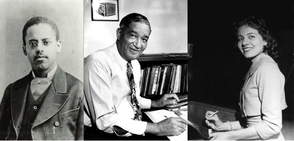
It’s Black History Month, once more. Because of that, it was time to write an article about historical Black figures who don’t get the spotlight as much. Dr. Martin Luther King, Jr. and Rosa Parks get the spotlight, and they should, but today, we will be looking at